They sure are! No strings attached. Just keep us in mind if you ever need help with recovering & converting lost customers.
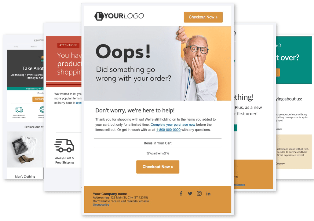

These free cart abandonment email templates come plug-and-play ready! Just copy & paste the HTML into your cart abandonment tool of choice, update your logo & links, and you’ve got a proven, high-converting cart recovery campaign!
We worked hard to create a set of templates that any business, in any industry can use to recover lost sales. Each of these emails offers a slightly different approach, to help you hone in on the messaging that resonates best with your customers.
Our goal is to help you create an email campaign automation that re-engages your colder prospects, increases necessary touchpoints, and brings back lost customers to complete what they started.
To help you understand the goal of each template, we've created this guide below!
We've all likely received an abandoned cart email at some point in our lives. At this point, most of us may even expect them after abandoning a shopping cart. To people in our industry, shopping cart abandonment emails are a basic email marketing strategy, and a must for any online business. But to the average shopper, they can be intrusive, and often get lost in the inbox along with every other "Don't forget about your cart" email.
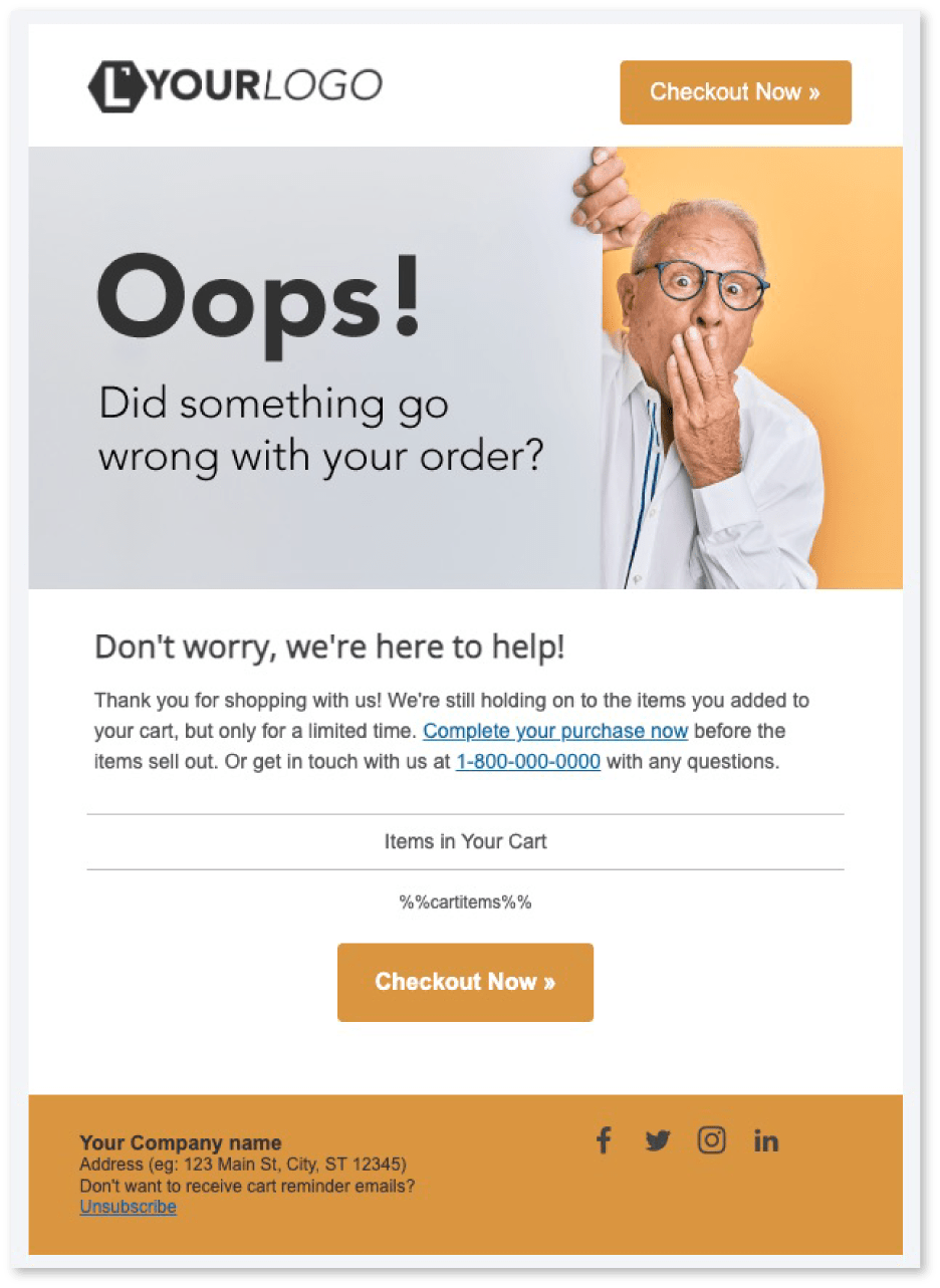
This tactic seeks to put the blame for the abandoned cart on your checkout process, rather than the customer. Instead of assuming the reason for the abandonment was because your shoppers got distracted, or weren't ready to purchase yet, this email makes the assumption that the abandonment was due to a technical error, or inadequacy on your company's end.
Out of all of the tactics we suggest to our customers, this is has the highest success in both open & conversion rates. When used as the first email in your reminder sequence, with the right subject line, you pave the way for your entire recovery campaign with support & kindness.
Online shoppers are inundated with marketing emails from the brands they follow, so it takes a lot to stand out in an overcrowded inbox. In Blackjack, you assume the dealer is hiding a 10 in order to give you the best advantage possible. In ecommerce remarketing, you assume your competitors are also remarketing hard to your prospects, in order to identify ways to give yourself an advantage.
Here, your advantage lies in the fact that recipients feel reassured and looked-out after, rather than marketed-to. The "Oops" or "Oh no" language is not only eye-catching, it paves the way for your brand to take the blame for the incomplete transaction, and offer support that encourages conversion.

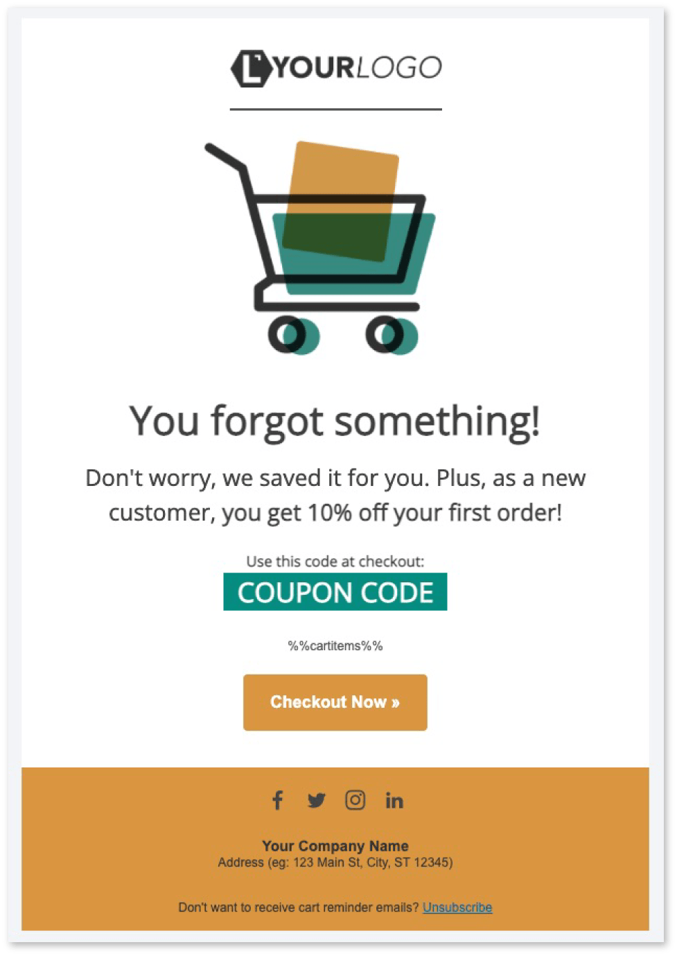
There are hundreds (if not thousands) of reasons someone may abandon a cart. Email number 5 (below) is where you'll find tactics for addressing many of these reasons at once. This template, however, focuses on the most commonly reported reasons for abandonment: Cost.
Maybe the total cost of the order was more than the shopper expected. Or maybe they began to checkout, but didn't realize the price of shipping would be so high. Both of these reason are related to the total cost, and both can be addressed by offering your abandoners some sort of financial incentive if they return to your website.
As a general rule of thumb, it’s normally not a good idea to send this as the first reminder in your sequence. Many of your abandoners simply got distracted, or weren’t ready to make the decision to purchase yet. For these shoppers, a simple reminder will often do the trick in getting them back to complete their purchase. Offering a discount right away might help your conversion rate, but may ultimately result in less recovered revenue.
Instead, set this reminder as the second or third in your sequence. This should ensure you’re not giving out unnecessary coupons to shoppers who would’ve converted anyways.
If you offer any sort of alt-pay solution on your website (like Sezzle, Affirm, etc) always be sure to include some call to action in your reminders about it! These solutions offer your shoppers the ability to split their purchase into 4 interest-free payments... an offer which pairs oh-so-nicely with an abandoned cart recovery campaign.
Think for a second about the factors influencing your decisions when comparing products on Amazon. Most likely, the total cost & shipping speed (Is it Prime?) are near the top of your list. So now let’s say you’ve narrowed it down to 2 similarly priced items... What do you look at next?
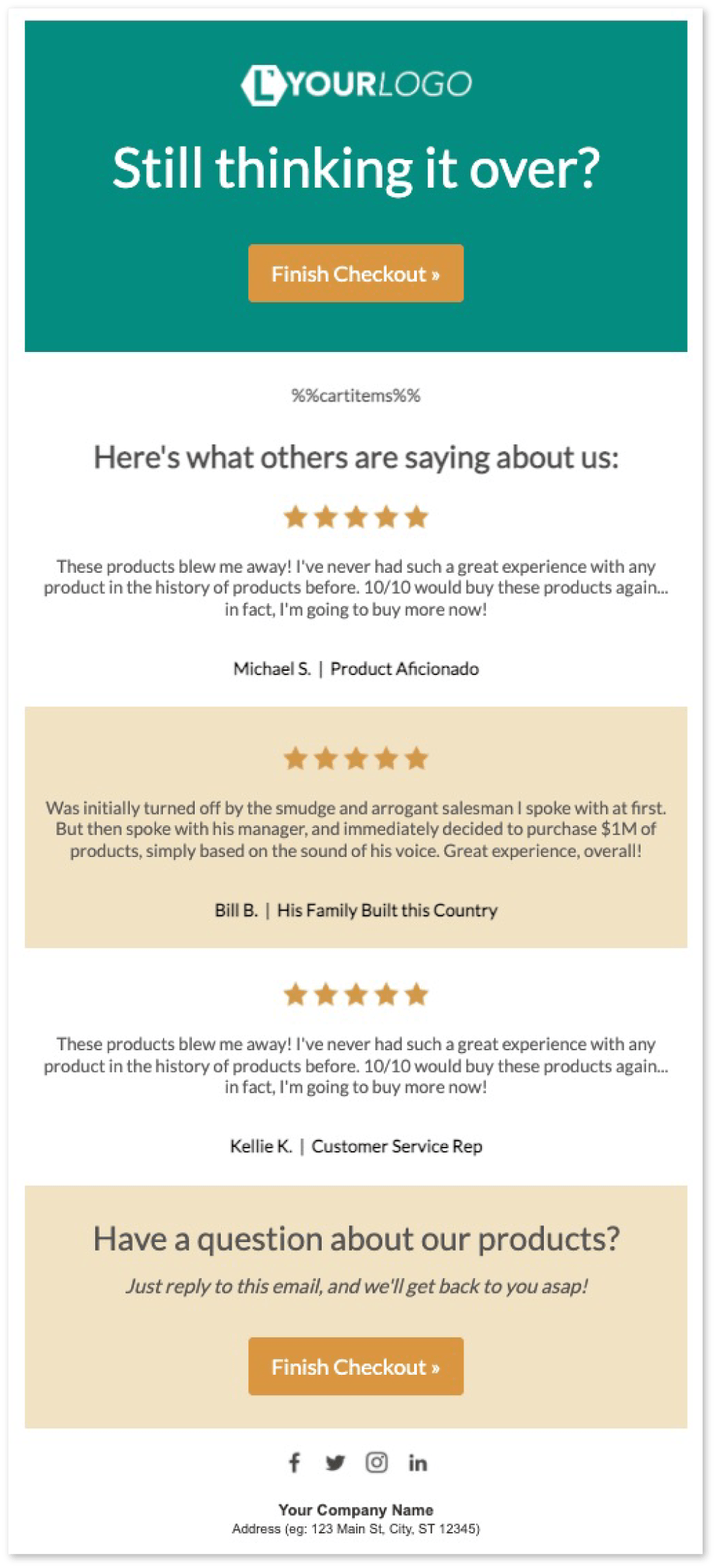
Sure, solid product images & descriptions play a big part. But for the majority of shoppers, it’s going to ultimately come down to whichever product has better reviews.
According to Finances Online:
Including product reviews in your emails means your shoppers don’t have to go looking for them. Actual customer testimonials and quotes reassure your abandoners that you and your products can be trusted, and are well-liked. Not to mention... The right testimonial combined with the right call to action can induce a sense of fomo as well, driving sales from shoppers who simply don’t want to miss out on how awesome everyone says you are!

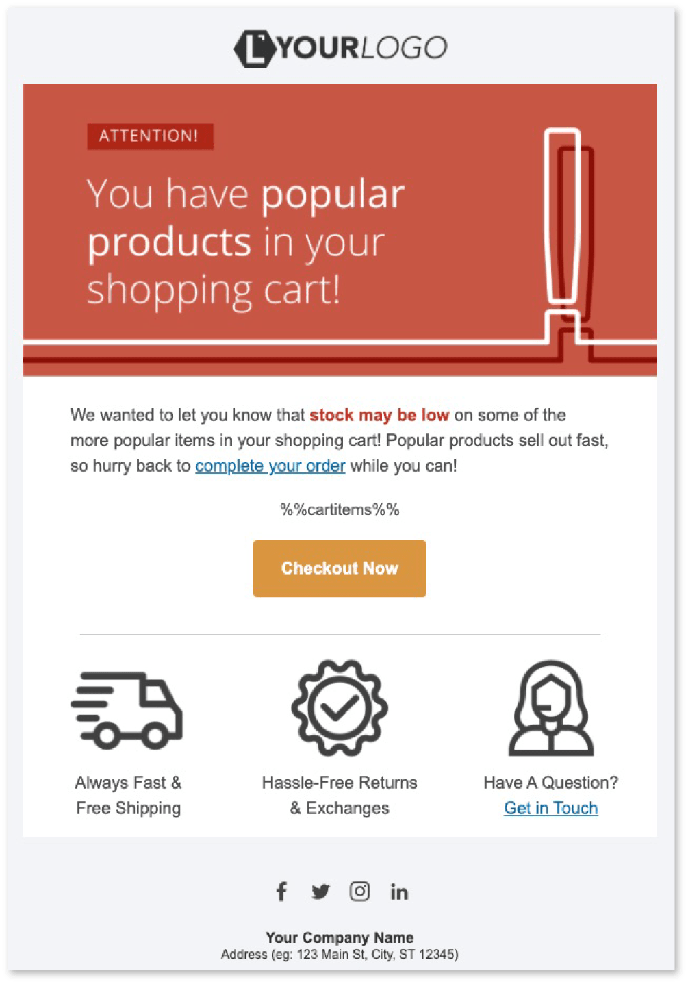

For buyers currently on the fence, scarcity and urgency are two of the most powerful tools in your arsenal to get them to convert. This reminder induces a sense of urgency with potential customers, by letting them know they may miss the chance to reclaim the shopping bag they left behind.
People want products or offers that are rare or difficult to get. Why? Because we think they are more valuable and we believe they will be unavailable to us, even if the verdict of scarcity is not actually there. Combine this with the fact that, often, our cart abandoners have higher purchase-intent than any other prospect on our website, and you’ve got a powerful tool for recovering lost sales.
Remember: Your CTA button copy should complement the messaging in order to drive action. For instance, if your subject line is “Your Cart is Expiring”, try using actionable copy like “Save My Cart”.
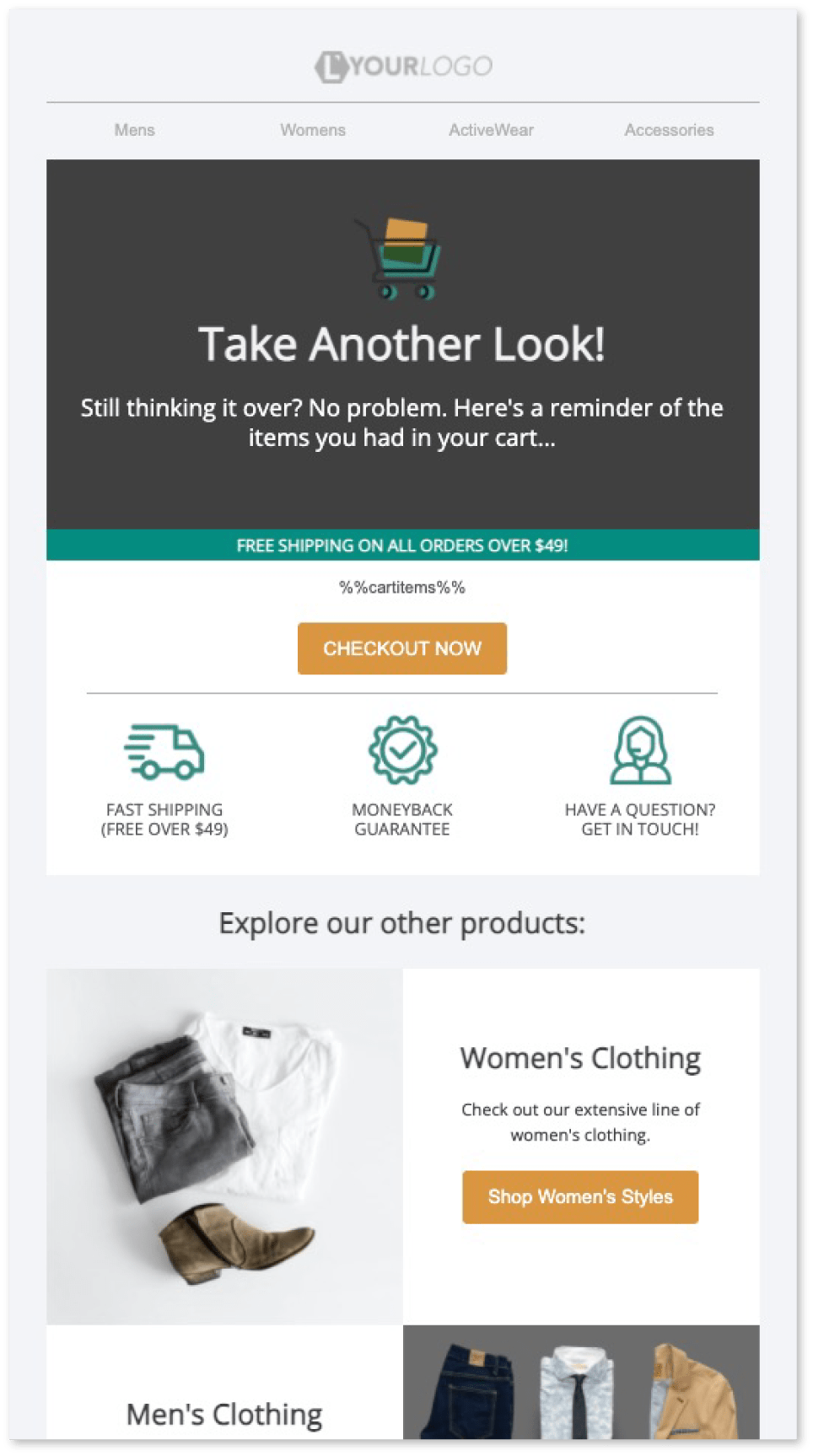
Without knowing the exact reason someone abandoned a cart, it can be difficult to customize your notifications enough to address it. Was it price? Shipping? A lack of credit card or payment options? Or maybe they simply have unanswered questions.
Nudge notifications like these attempt to address many of your potential customers’ barriers to entry at once. The goal here is to remind the shopper of any benefit to purchasing from you they may not have seen while on your site.
This reminder is essentially a compilation of all of the reasons someone should purchase from you. It’s almost like a mini version of your website... Offering support while providing product, shipping and pricing information. Not to mention, it includes a section at the bottom aimed solely at re-engaging shoppers who may have lost their initial interest. It even includes a section to drive shoppers to your social media accounts.
They sure are! No strings attached. Just keep us in mind if you ever need help with recovering & converting lost customers.
Your download will include the "3 Email Recipe" implementation guide, with instructions for customizing the HTML templates. You'll also have the option to use our drag & drop email builder to more-easily upload your logo & branding, and export the HTML for use elsewhere, if you'd like.
Abandoned cart emails are a vital remarketing tool, but have you ever thought to find out what’s keeping your shoppers from purchasing in the first place? Let us know your website and we'll review it to identify which barriers may be keeping your shoppers from becoming customers. Then we'll send you a list of recommendations for lowering your cart abandonment rate.
We'd love to show you why our customers love us so much! Schedule a 15 minute CartStack demo here, for the full tour. Or watch a quick demo now.
An abandoned shopping cart campaign is the simplest way to lower your cart abandonment rate, and a vital tool for any successful e-commerce business. In doing some research, you’ll find there are several ESPs and plugins that offer a basic cart recovery email app. Most of these will require complicated integrations and extensive development in order to get you the best results.
At CartStack, shopper recovery is all we do, and we strive to be the best in the world at it. We’ve included functionality that takes the extensive development required by most systems out of the picture, and gives you results from the start. Our “Right Message, Right Time” philosophy results in open rates typically in the high 50’s & conversion rates averaging 15-20%.
If you'd like to use these templates with CartStack, our system will use this section to automatically personalize your reminders with images & descriptions of the items the shoppers left behind. If you're using them with another provider, just delete this text.